
This blog post isn't so much full of recommendations as it is full of angst and woe and a bit of frustration. About time. Or rather, lack of it. Or maybe about laziness. Or motivation. Or something.
A lot of people doing Zazzle seem to be able to manage their time very well. They are putting up tons of new designs all the time, churning them out. I am, well, not doing that. I don't see how anybody does. So I'm looking for ideas.
I'm a freelancer, so I don't go to a bricks and mortar location each day to work. I step in front of my computer. But being a freelancer comes with its own set of huge pressures, especially since I am a SINGLE freelancer. If I don't work, I don't eat and the dogs don't get their kibble. I can afford to lose a few more pounds, the dogs not so much. I do not have a husband working full time to take the pressure off.
And at the moment, freelancing pays much better than Zazzle. The frustration is that if I did more Zazzle, it would eventually bring enough income on a steady basis that I could be a lot more comfortable instead of looking around each month and wondering if my fairy godmother was going to bonk me on the head with a million bucks. And the reality is that when a client has a job for me, the Zazzle work has to come second (or fourth, or unfortunately too often last).
In addition to the freelance work, I also teach dog training classes, show dogs, go to the gym every day, am President of my local dog club, help run my local dog training center. Oh and I'm prepping for a 5k race. And yeah, some evenings when I don't have to teach, I just veg out and indulge another of my passionate hobbies, reading fun and trashy genre fiction; urban fantasy, fantasy, sci-fi, romance, even mystery.
And when I am designing for Zazzle, I spend a lot of time on my designs. I do not want to put schlock out there. I want a beautiful design people will be proud to wear. A design **I** would be proud to wear.
So blog readers (if any of you haven't fallen asleep by now) how do you do it? How do you keep up with everyday life and also put so many designs onto Zazzle? Do you compromise quality? Have a hubby/wife that supports you financially? What? I'm sure open for ideas...
Thursday, March 11, 2010
Sunday, January 31, 2010
Using Pantone Colors in Zazzle designs
Most professional graphic designers know that the best way to assure consistent color in a design is to use Pantone colors and the Pantone Matching System (PMS). Pantone sets color for every single commercially produced product you see, from the trademarked Coca-Cola red (which no, you and I do not have access to) to the subtle shimmery grey seen on models striding the catwalk at spring fashion week. Pantone has patented the idea of looking at a swatch and being able to translate that swatch of color to an exact match in a magazine.
PMS's backbone are their color swatch books, a series of books which show the exact shade of each of thousands of colors and tints so designers can find just the right shade for their project.
But Zazzle doesn't use Pantone. Zazzle uses an rgb (red/green/blue) color space which is actually rather odd, since rgb is meant for monitors. And since monitors are lit from behind, colors appear very different than they do on a flat piece of non-luminous printed material, whether it be a t-shirt or an invitation. But say you want to get something at least fairly close to a PMS match and you want to know that a certain color is being printed on your design. How do you do it?
First you invest in PMS swatchbooks. My suggestion is to go for the basic gold-standard, the PMS Formula Guides for Coated, Uncoated, and Matte. These are their basic color sets, printed on shiny (coated) dull (uncoated) and matte finished papers. A color will look very different depending on what surface it's printed on, because the harder the surface, the more the color will sit on top. The softer the surface, the more the color will soak in. A color that looks very bright and saturated on a coated surface will look much darker and duller on an uncoated one. Yes, this is an investment. But well cared for, your swatchbooks will give you years of service.
Okay, so now you have your books. You want to do a wedding invitation, and you know you want to select a gloss finish in Zazzle for the invitation. So you flip through your swatchbook for the color you want to lay over the background, and you choose PMS 7503. But there's nowhere in Zazzle to specify Pantone colors. Because Zazzle uses rgb web colors. Bummer. However, at the bottom of Zazzle's color palate is a place where you can insert a HexDex color value. This is a combination of six letters and numbers that simulate other colors. The trick is to figure out which HexDex value most resembles PMS 7503. And actually, that's easy to do if you have Photoshop or Illustrator.
In Photoshop, you only need to double click on the color swatch in your main toolbox to bring up the color picker. Once there,click on Color Libraries, and chose Pantone Solid Coated for your book. Scroll down and pick Pantone 7503 C, then click on "Picker."
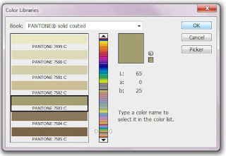
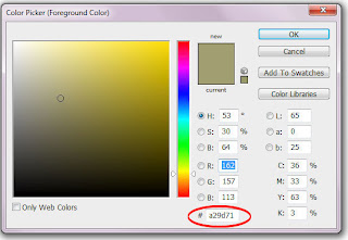
Once you're back at the picker screen, all you need to do is find the HexDex value at the bottom of the screen. Write it down. You can then assign that number in Zazzle to replicate very closely the PMS color.
It's a bit more difficult to find the value in Illustrator. First, you have to locate the color books. Click on the Swatches, then on the little arrow and menu icon at the top right to open the full swatches menu. Click on "Open Swatch Library," then "Color Books," then select "Pantone Solid Coated."

This will bring up a window full of tiny swatch colors. Click on "show find field" to be able to enter a number in that menu (which I find only works about half the time). Or just scroll down until you find the color; hover over a swatch with your mouse to bring up the number.
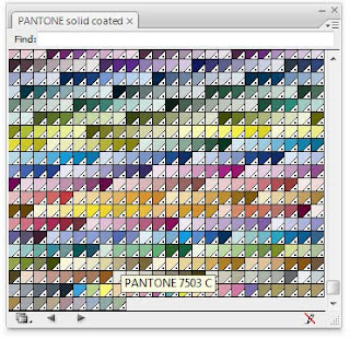
Once that's done, you can double click on the color on your leftside toolbar to find the HexDex value as you did in Photoshop. As a designer's note, I make the Pantone color book as part of my Workspace in Illustrator by dragging it over onto my rightside toolbar and saving the workspace.
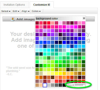
In Zazzle's Background Color box, the value you need to replace is at the very bottom right, with a greyed out "FFFFFF". Just replace the FFFFFF with the appropriate HexDex color, in this case (a29d71 in this case). I follow internet conventions to enter all code in lower case.
I find that greens and blues tend to color shift fairly dramatically from PMS book to screen, but usually the PMS value will work for your Zazzle pieces quite well. Be sure to keep your PMS books in a cool dry place, and always closed, to prevent sun-fading.
PMS's backbone are their color swatch books, a series of books which show the exact shade of each of thousands of colors and tints so designers can find just the right shade for their project.
But Zazzle doesn't use Pantone. Zazzle uses an rgb (red/green/blue) color space which is actually rather odd, since rgb is meant for monitors. And since monitors are lit from behind, colors appear very different than they do on a flat piece of non-luminous printed material, whether it be a t-shirt or an invitation. But say you want to get something at least fairly close to a PMS match and you want to know that a certain color is being printed on your design. How do you do it?
First you invest in PMS swatchbooks. My suggestion is to go for the basic gold-standard, the PMS Formula Guides for Coated, Uncoated, and Matte. These are their basic color sets, printed on shiny (coated) dull (uncoated) and matte finished papers. A color will look very different depending on what surface it's printed on, because the harder the surface, the more the color will sit on top. The softer the surface, the more the color will soak in. A color that looks very bright and saturated on a coated surface will look much darker and duller on an uncoated one. Yes, this is an investment. But well cared for, your swatchbooks will give you years of service.
Okay, so now you have your books. You want to do a wedding invitation, and you know you want to select a gloss finish in Zazzle for the invitation. So you flip through your swatchbook for the color you want to lay over the background, and you choose PMS 7503. But there's nowhere in Zazzle to specify Pantone colors. Because Zazzle uses rgb web colors. Bummer. However, at the bottom of Zazzle's color palate is a place where you can insert a HexDex color value. This is a combination of six letters and numbers that simulate other colors. The trick is to figure out which HexDex value most resembles PMS 7503. And actually, that's easy to do if you have Photoshop or Illustrator.
In Photoshop, you only need to double click on the color swatch in your main toolbox to bring up the color picker. Once there,click on Color Libraries, and chose Pantone Solid Coated for your book. Scroll down and pick Pantone 7503 C, then click on "Picker."

Once you're back at the picker screen, all you need to do is find the HexDex value at the bottom of the screen. Write it down. You can then assign that number in Zazzle to replicate very closely the PMS color.

It's a bit more difficult to find the value in Illustrator. First, you have to locate the color books. Click on the Swatches, then on the little arrow and menu icon at the top right to open the full swatches menu. Click on "Open Swatch Library," then "Color Books," then select "Pantone Solid Coated."

This will bring up a window full of tiny swatch colors. Click on "show find field" to be able to enter a number in that menu (which I find only works about half the time). Or just scroll down until you find the color; hover over a swatch with your mouse to bring up the number.

Once that's done, you can double click on the color on your leftside toolbar to find the HexDex value as you did in Photoshop. As a designer's note, I make the Pantone color book as part of my Workspace in Illustrator by dragging it over onto my rightside toolbar and saving the workspace.
In Zazzle's Background Color box, the value you need to replace is at the very bottom right, with a greyed out "FFFFFF". Just replace the FFFFFF with the appropriate HexDex color, in this case (a29d71 in this case). I follow internet conventions to enter all code in lower case.

I find that greens and blues tend to color shift fairly dramatically from PMS book to screen, but usually the PMS value will work for your Zazzle pieces quite well. Be sure to keep your PMS books in a cool dry place, and always closed, to prevent sun-fading.
Wednesday, July 15, 2009
Font mania
I am a font junkie. Imelda Marcos had her shoes, I have my fonts. There is no such thing as too many typefaces. But having lots and lots of fonts doesn't mean fonts don't come with rules. Like everything else in design, there's a way to use them properly and a way to abuse them too.
Zazzle does provide a number of different fonts, and I do use them on occasion but perhaps not as often as others do. I pretty much only use Zazzle's fonts for designs where customers will be inputting their own text. I'll use Zazzle fonts on the inside of cards as an example. But other than that, I prefer to use my own fonts, even if my font is identical to one of Zazzle's. Why? Because when I'm using my own font in my own design software, I have much more power to get that font the way I want.
Let's take a logo I just designed for a friend. I used two different typefaces, Scriptina and Myriad Pro. If I had those fonts in Zazzle, I'd be forced to use them as is, at the weight and spacing they come in. That logo would look like this.
 Now let's look at that logo again, this time with changes. I made the Q bigger, distorted it some, and overlaied it so it fit better with the rest of the word. I added a lot of character spacing to the words "English Springer Spaniel, to give it dramatic emphasis. The difference is what makes this a logo, rather than just a collection of items on the page.
 You too can make fonts work for you. The first thing to decide, when you're doing a piece for sale at Zazzle that will involve fonts, is the message you are trying to convey. Do you want to be bold? Angry? Sweet? Soft? Lovely? Elegant? Persuasive? Traditional? Modern? Funky? If you have artwork, your font also needs to match your artwork. Putting a super-elegant script font with a modern, funky piece of artwork is likely to be jarring to the viewer. It won't match.
Don't get carried away either. With very few exceptions, you should not use more than one or two typefaces per item. Too many typefaces quickly starts to look junky and unplanned, and I bet most of you don't want that to happen. One trick some of us use is to work with typefaces that have a good number of weights and styles. Myriad Pro is one of my real "go-to" fonts, because it's readable at very small sizes, it can carry body text or titles, and it has light, regular, semi-bold, bold, and black faces in book, italic, and condensed. If I had to live my life with only one or two fonts (oh, the torture...), Myriad Pro would be one.
Serif vs Sans Serif
Some of you probably don't even really know what Serif and Sans-Serif means, so let me give you a quick definition. Serif fonts have serifs. What are serifs? Serifs are the little "feet" on letters. So serif fonts have feet. Those little feet help lead the eye from letter to letter and generally make text more readable. That's why you'll find the text in every novel you buy in some sort of serif font. The most used (and overused, and tired, and please do not ever use it) serif font is Times Roman.
Sans Serif fonts are fonts without feet. Sans means without in French, so it's pretty logical. Sans Serif fonts make great header fonts, but also are good to use at very small sizes because they tend to maintain their weight through the stroke, unlike serif fonts that often get thinner and fatter, thus fade out at tiny sizes. Arial is today's most common Sans Serif font and again, should be avoided in artistic design for that very reason; it's tired.
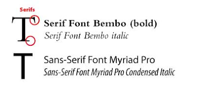
In addition there are, of course, many other font types. Decorative fonts, script fonts, display fonts, hybrid fonts (which combine elements of both serif and sans serif, a good one is Trebuchet, which this blog is using).
I could write books about fonts, but I won't. It's already been done. The purpose of this post is to try to get you to think about fonts as design elements and use them appropriately. If possible, it's far better to create your design's fonts in programs such as Illustrator or Photoshop where you have unlimited ability to manipulate them rather than just relying on Zazzle's fonts. Meanwhile, start thinking about the best way to incorporate text into your design, and your design into text. The right choice, manipulated the right way, is the difference between okay designs and dynamic designs that sell.
Friday, July 3, 2009
Adding a Twitter Feed
I've finally explored Twitter feed. I think if you have a twitter page, twitter feed could be a great way to bring new customers to your Zazzle store. But like everything, use it responsibly!
Here's how to set it up.
First, you have to have a Twitter page.
Next, go to Twitter Feed and sign up there. You'll need to add your twitter page first, before anything else. Then once it confirms your twitter page, you can add feeds. Just click"Create New Feed."
Once you click "Create New Feed," you'll need to name your feed, and you'll need to give Twitter a valid RSS feed URL. What is that? It's a special link that Twitter needs to automatically post your entries to Twitter. You can get your RSS feed URL by going to your main store site and looking for, then clicking on, the little orange box with the white arcs in it. It will probably be in the same box as your site URL. That will pop up a different address that you can then paste into twitter feed. Be sure to check it.
If you want, you can customize the feed to add other information, but basically, you're done. They've also got a great help feature if you get confused.
But now let's talk about whether you should use Twitter feed. And whether you should depends on how often you load designs, and how many unique designs you load vs not so unique. I tend to use a modified form of the Quick Create feature, loading maybe 5-15 different products in each of my designs at once. If I chose to do a twitter feed from my main Zazzle page, it would pop up a tweet for each of those products. Now me, I think that's too much noise and way too much like spamming. So instead, what I've elected to do is add this blog, and I will also select one particular product from each of my new designs and individually tweet it. You can either just click the "Twitter" link on the product page, or click "Share This." I prefer the latter, it seems to work faster and allows me to hand describe my product in my tweet.
Good luck, don't spam, but if you have a blog, or if you mostly produce individual items, twitter feed can be a great way to automatically get your stuff out there!
And....she's back!
I'm so sorry to have been gone so long. It's been sort of a crazy month or so. I have only seldom been able to work on my store, in fact this is one of very few new designs I've done. I've been working on a couple of book designs for Clean Run, which is mahvellous, dahlink, because it brings in big bucks. But I've missed the pure creativity of designing things just for myself (well, and for all the people I hope will buy them.
I was thrilled that Zazzle decided to not do shipping last month, let's hope they restructure the whole shipping package; right now their shipping is far too high! But thanks to their promotion, I had one of my biggest months ever in spite of not being able to give the store the attention it deserves.
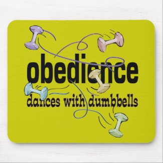
I had a giggle over this design. For those of you not into dog obedience it may not make much sense. But anyone who has ever tossed an obedience dumbbell for a dog to fetch and had it go careering all over the place (into the next ring, behind you or even, in one case, hanging in a light fixture) will get this one! And this is one shirt I actually did a front and back design for. Front shown here, but there's another dumbbell on the back too. Hope you enjoy.
Friday, May 29, 2009
It's that time of year


June is almost here, and our local Farmer's Market has been cooking along since April. But only now is the really good stuff starting to come in. Last week I bought a quart of strawberries so sublime that they lasted less than 24 hours. And yep, I ate every single one myself. Asparagus is fazing out. I haven't seen peas yet, but maybe I missed them with all the trialling I was doing in April.
I can't always afford to eat local and organic but when I can, I do. The food is better. It tastes better and it's better for you. Luckily our local farmer's market is large and diverse. There are products for palates from around the world, and to sell at our market the farmer must be local (within a certain mile radius of my town) and must have produced the product for sale. No importing, even from neighboring states. The Sustainable agriculture design won a Today's Best award at Zazzle!
Thursday, May 28, 2009
Bags are back!

Woo hoo! Finally!
Bags have been out of stock for months and months. They're back now, which means I know have to get busy putting designs on bags, which is sort of a PITA. Anybody who says doing a POD is easy is wrong. It's a lot of constant work, but well worth it.
Subscribe to:
Posts (Atom)

